
In Praise of Firefox’s Updated Accessibility Inspector
Greetings Liebe Leute!
Today I want to write about my experience using Mozilla’s accessibility Inspector Panel, and how using it made me a better web developer as well as greatly improved our website www.classmethod.de .
Disclaimer: I don’t consider myself a professional front end web developer, - yet. I know a good chunk for sure, but I would say my knowledge of creating websites still has a long way to go. But I continue to make baby steps.
One of the ways I commit myself to learning web development is by being signed up to the MDN (Mozilla Developer Network) mailing list. I can honestly say that I look forward to getting e-mails from them every week. The MDN Docs are truly a top resource for anyone who wishes to learn web development. It has a very welcoming community feel, there are no frills, it's straightforward and they are a 'privacy first' oriented web browser. They also have some amazing browser extensions.
So last Friday on Halloween, in Berlin (which doesn’t really celebrate sadly, but I digress) I read Marco Zehe’s article titled “Auditing For Accessibility Problems With Firefox Developer Tools.” In his article he talks about Firefox's updated accessibility inspector which functions as “an auditing facility to help identify and fix many common mistakes and practices that reduce site accessibility.” And it turns out I made a ton of these common mistakes.
How to use the inspector:
In the Mozilla Firefox browser, you go into the inspector just as you would normally, then go to the arrows on the right and click on ‘accessibility’.
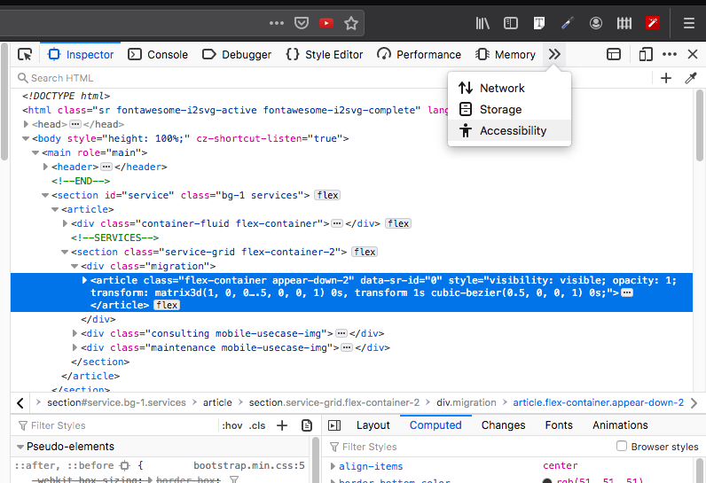
You can check for specific issues such as contrast, or for all issues by using this tab.
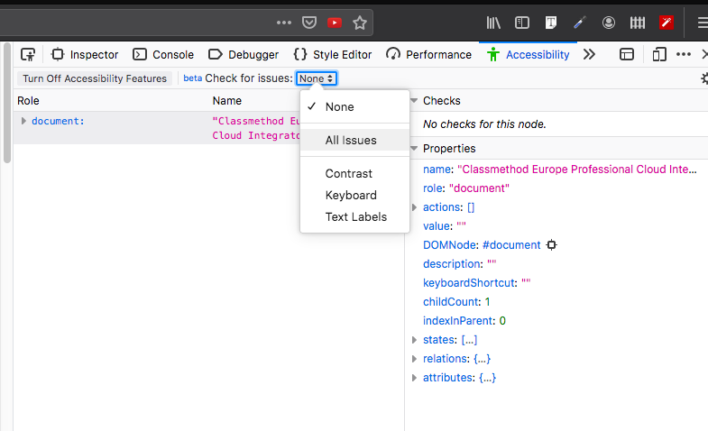
By clicking this icon in the corner you can turn on ‘Accessibility Features’ .
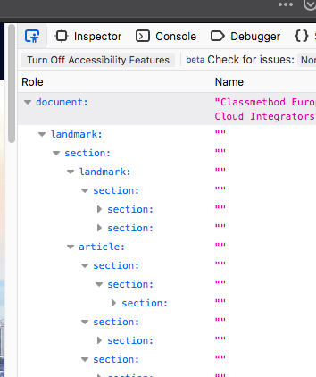

With these features on, you can scroll through each element of your webpage and see if it is following accessibility standards.

Uh oh, seems like there isn't enough contrast on this element.
In the right panel of the inspector, Mozilla even provides a 'Learn More' link to help you better understand what the error means.
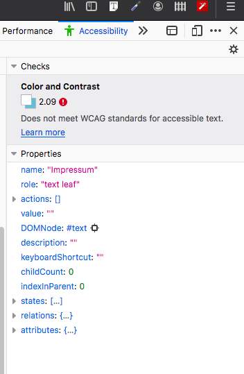
I will focus on how I corrected issues on our website concerning contrast -which have since been improved. According to Zehe's article this is what constitutes as acceptable contrast and how Firefox uses these standards in their accessibility inspector.
Contrast
Firefox includes a full-page color contrast checker that checks for all three types of color contrast issues identified by the Web Content Accessibility Guidelines 2.1 (WCAG 2.1):
- Does normal text on background meet the minimum requirement of 4.5:1 contrast ratio?
- Does the heading, or more generally, does large-scale, text on background meet the 3:1 contrast ratio requirement?
- Will interactive elements and graphical elements meet a minimum ratio of 3:1 (added in WCAG 2.1)?
Here are some before and after snapshots
Before

After

Before
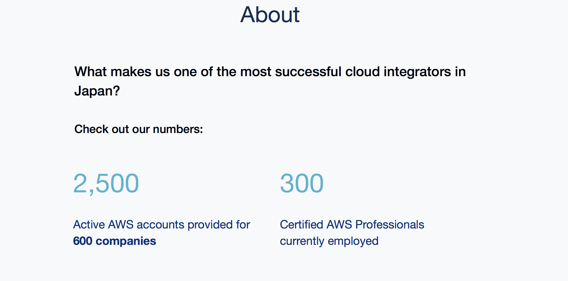
After

Before 
After

Why it’s important
According to the The World Wide Web Consortium (W3C) “the main international standards organization for the World Wide Web (abbreviated WWW or W3).” This is why accessibility matters:
“The Web is fundamentally designed to work for all people, whatever their hardware, software, language, location, or ability. When the Web meets this goal, it is accessible to people with a diverse range of hearing, movement, sight, and cognitive ability...However, when web sites, applications, technologies, or tools are badly designed, they can create barriers that exclude people from using the Web.”
https://www.w3.org/standards/webdesign/accessibility.html
In Conclusion
Our website looks cleaner, sharper and delivers our message more simply and clearly. Most of all, it is inclusive to everyone. I learned something new by following these best practices for accessibility and I feel, dare I say, even a little more confident in my abilities as a front end developer.
Mozilla has made it easy for your website to meet accessibility standards. So why not give this cool new tool a try :)

![[小ネタ] DeepL 公式ブラウザ機能拡張の Firefox 版がリリースされていました!](https://devio2023-media.developers.io/wp-content/uploads/2023/12/202312-deepl-extension-for-firefox-eyecatch.jpg)


